Dashboards overview
What OrionGIS Insights dashboards are, how to browse them, use the filters, and show a dashboard full-screen.
Insights turns your catalogue and field data into dashboards — pages of numbers, charts and tables that update as data arrives.
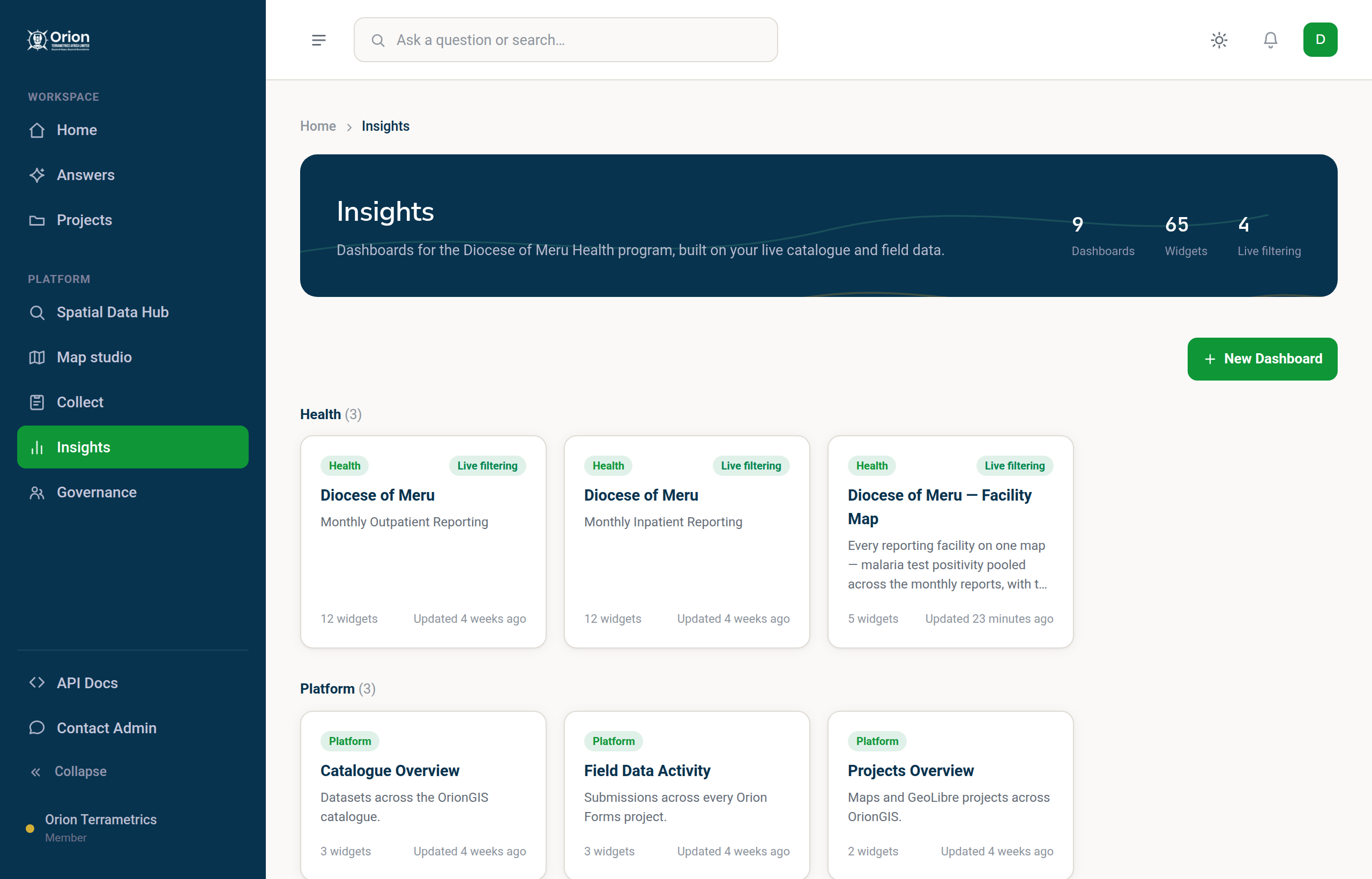
#The dashboard gallery
Choose Insights in the sidebar to see every dashboard as a card. Each card shows the dashboard's name, how many widgets it has and when it was last updated. Dashboards that have filters are marked Live filtering. Click a card to open it.
#Reading a dashboard
A dashboard is a grid of widgets. Depending on how it was built you will see:
- Indicators — one big number, such as total submissions;
- Indicator stacks — a group of related numbers you page through, such as each disease in a health report;
- Gauges;
- Charts — bars, lines and pies for comparisons and trends;
- Tables;
- on dashboards set up for facility reporting, a facility list you can click, a facility map and a coverage panel showing how many facilities have reported.
#Filter
Dashboards set up for live filtering have a header with:
- Month — which reporting period the data is about (or All months);
- Time Range — All Time, Last Week, This Month, This Quarter or This Year, filtering by when submissions were received;
- Facility — click a facility in the list to focus the whole dashboard on it; a Facility chip at the top shows the filter and lets you clear it.
All widgets update together.
#Full screen
Choose Full Screen above the dashboard to fill the screen without the sidebar, for a meeting or a wall display. Filters still work.
#Ask about a dashboard
Dashboards with live filtering have a chat panel where you can ask a question about what you are looking at, in plain language.
#Build your own
See Build a dashboard.
Something missing or unclear? Tell us — we update the guide as the platform grows.